︎︎︎ Back
Certa AI (Opinr Inc.)
Brand Identity System
Brand Identity System
︎︎︎Brand Guidelines
︎︎︎Digital Collaterals
︎︎︎Website Design
Project Brief:
How do you tell a story about trust in a world built on complexity?
Certa is an enterprise SaaS product built to manage third-party risk. But before users can trust the platform, they have to understand it. The brand needed more than a new identity. It needed a narrative that could translate abstract AI systems into something intuitive, emotional, and clear.
I led the creation of a visual language designed to move across product flows, launch storyboards, motion systems, campaign moments and in-person events. At its center is a form that acts as both portal and pause, a metaphor for connection, rhythm, and control.
The result reframed Certa from invisible infrastructure into a signal of trust. Not just built to scale, but built to speak to the humans using it.


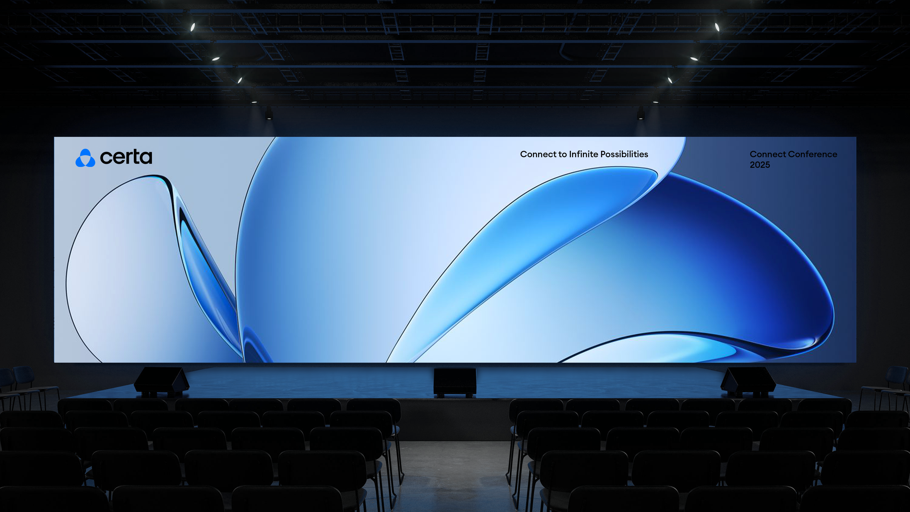
System Built to Tell a Story:
The identity system was designed to express the story in motion.
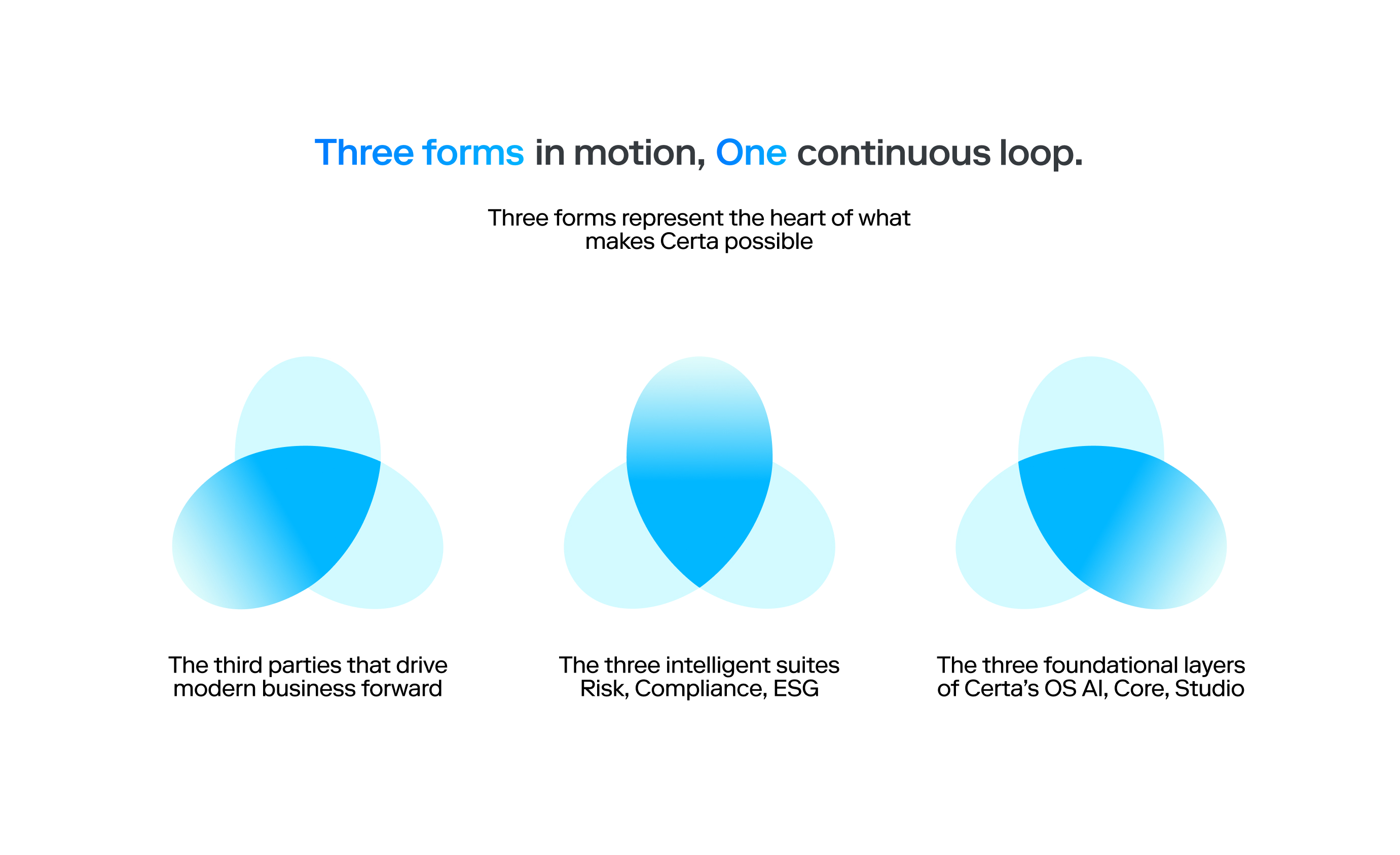
At its center is a simple loop of three forms. It’s a visual rhythm that mirrors how Certa works at every level. The third parties we service. Three intelligent suites. Three foundational layers of the platform. Three global regions. Even the product’s core value propositions are framed in threes. The repetition is intentional. The form is a symbol of structure, rhythm, and clarity in a space that often feels complex and fragmented.
This system was created entirely in-house with one brand designer reporting to me. Together, we built a design language that adapts across campaign creative, product UI, and editorial content while staying grounded in the same core story.
Logo Animation:
In motion, the forms rotate continuously, creating a loop that reflects Certa’s role in connecting people, policy, and AI in sync. These motion principles shaped the entire system. Gradients were designed to flow. Typography carries intentional pacing. Layouts reflect how users move through layered decisions.


Brand Guidelines


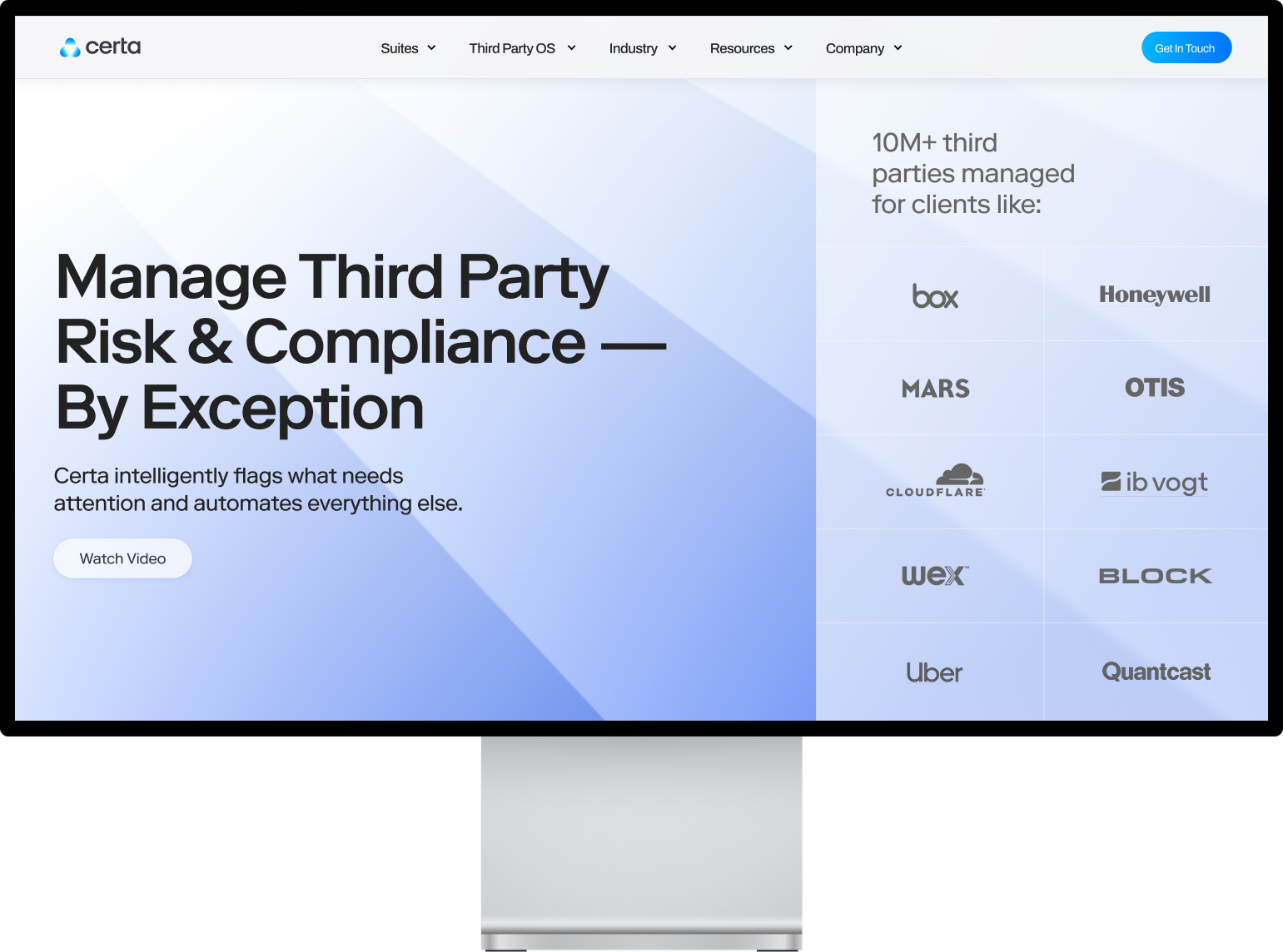
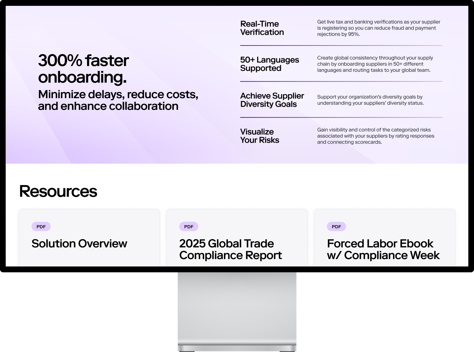
The website brings the narrative to life through interaction and flow.
We applied the identity system with the user’s experience at the center. Every detail from typography and motion to spacing and tone was shaped to support how people take in information, make decisions, and find their way through something unfamiliar.
We applied the identity system with the user’s experience at the center. Every detail from typography and motion to spacing and tone was shaped to support how people take in information, make decisions, and find their way through something unfamiliar.


Interal Flow::
Structure and pacing reflect the mindset of an enterprise user. The homepage introduces the brand with intention. Product pages carry the story forward with depth and control. Transitions are quiet. Messaging is focused. The design leaves room to think.
Storytelling shaped every layer of the experience. It lives in how the content unfolds, how the interface guides, and how the brand steps back when it needs to. The system stays present without ever getting in the way, and always in service of the person on the other side.
Storytelling shaped every layer of the experience. It lives in how the content unfolds, how the interface guides, and how the brand steps back when it needs to. The system stays present without ever getting in the way, and always in service of the person on the other side.